impres.co - Brand intensive package
Impres.co is a digital marketing agency whose purpose is to democratise marketing for Malaysian SMEs.
The work articulates a grounded, modular identity, a teachable suite of client deliverables, and a clear visual language that signals credibility without coldness.
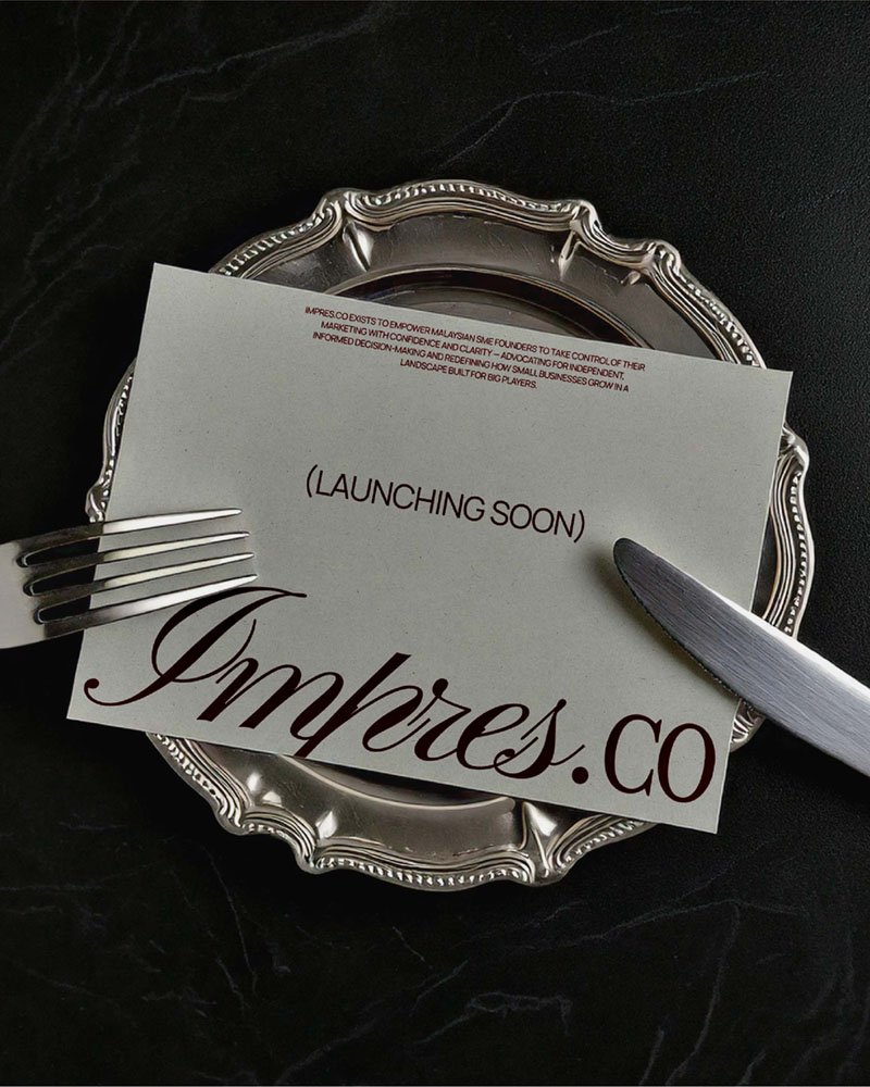

The outcome: a professional brand that communicates structure, transfers capability, and positions Impres.co as an accessible strategic partner for founders who want to own their marketing.
Identifying the problem
Many SMEs experience marketing as either opaque (buzzwords, overpromised outcomes) or extractive (ongoing retainers that create dependency). This generates distrust, wasted budgets, and weak internal capability. Impres.co required an identity and productised system that would:
Immediately communicate credibility and pedagogical intent.
Make the agency’s process legible and repeatable to non-expert founders.
Scale across formats: decks, playbooks, workshops, and dashboards.
Target audience
Primary: Founders and decision-makers at Malaysian SMEs who are growth-minded but time-poor, skeptical of marketing vendors, and keen to build internal capability.
Secondary: Small leadership teams and marketing owners who will use Impres.co’s tools and processes day-to-day.
Qualitative Research
Research revealed three persistent tensions:
Skepticism vs. Need: Founders want growth but distrust marketing promises.
Complexity vs. Clarity: Marketing advice often arrives as frameworks or templates that founders cannot operationalise.
Dependence vs. Independence: Many agencies create reliance; founders want to learn, not be outsourced.
Key insight: Trust is earned by teaching—not by doing alone. Brands that demonstrate how to act and hand over repeatable tools will convert skeptical founders into confident partners.
Strategic Approach
We positioned Impres.co as a Rational Advocate + Independent Thinker. Strategy pillars:
Clarity as product — every artifact must reduce ambiguity: one next step, one metric, one owner.
Teach-to-scale — deliverables are intentionally teachable: playbooks, one-page strategies, and templates that clients can operate without continuous external support.
Assertive partnership — provide decisive, evidence-based recommendations while remaining empathetic and approachable.
System-first design — the identity behaves like a toolkit (modular, repeatable, extensible) rather than a purely decorative brand.
Tactical moves included a restrained typographic system, a modular icon and grid language, and a suite of client-facing assets structured to demonstrate process up front.
Challenges & Solutions
Challenge — Signal credibility without becoming cold or corporate.
Solution: A measured typographic voice (serif for authority, sans for utility), a muted but confident palette, and copy that balances reason with warmth. Visuals emphasise process and outcomes over glossy case imagery.
—
Challenge — Create a mark that expresses logic + creativity without cliché.
Solution: A typographic, reflection-based icon derived from the letterform "a" representing Alvin(founder). A mirrored companion form suggests creative dialog (Jolinna - founder) and yields a balanced, butterfly-like silhouette as a byproduct. The mark is intentionally system-like—modular, scalable and constructed, so it reads as reasoned structure rather than decorative symbolism.
Here’s how it turned out
Take a look at the final brand design
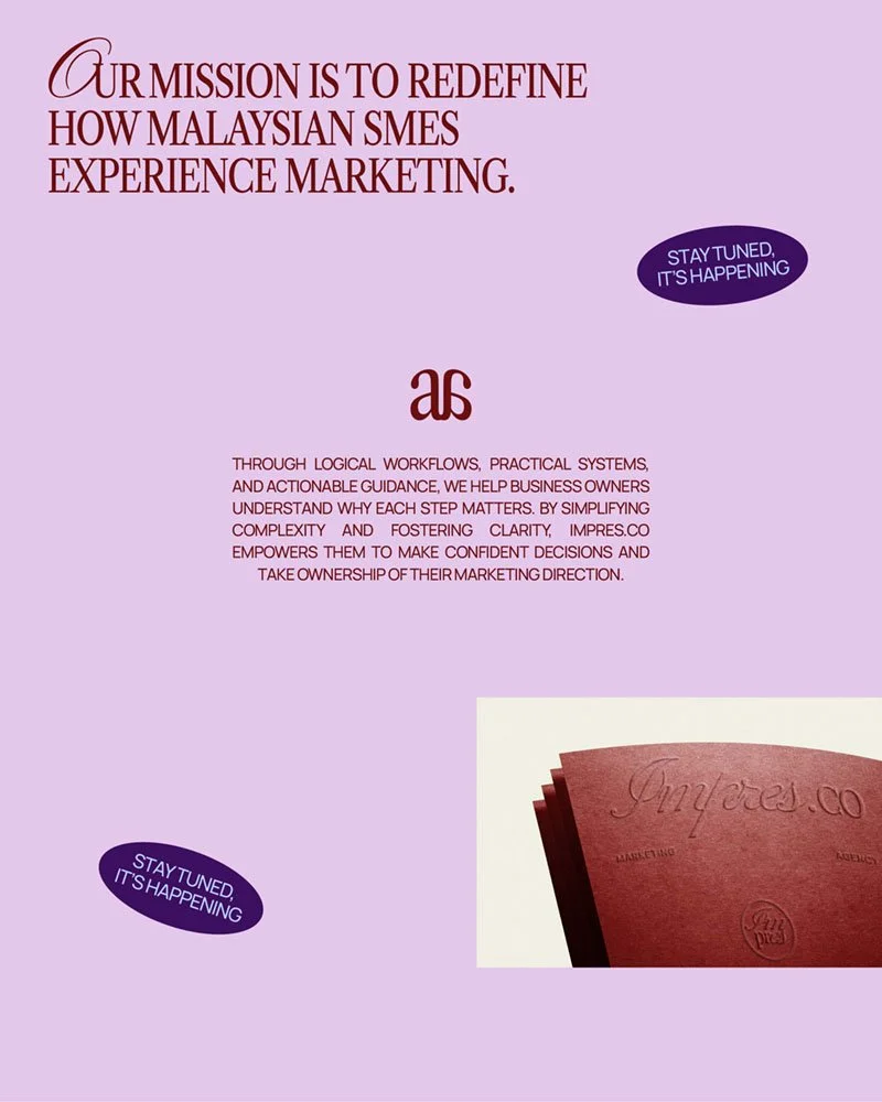

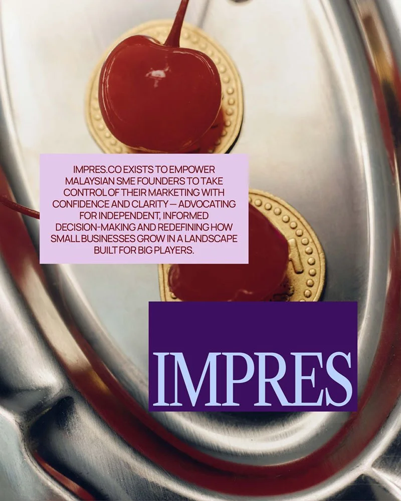

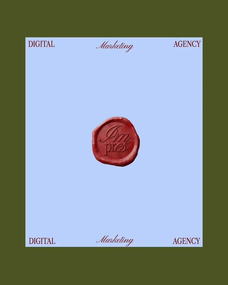
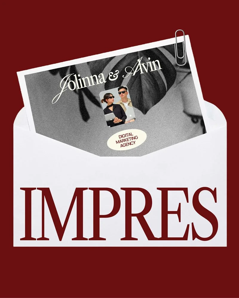
go from idea soup to “holy sh*t, that’s my brand”
If this project made you feel something… that’s the power of brand design.
Now imagine what that power could do for your brand. Whether you’ve got a fully-formed brief or just chaos in a Google Doc, I’m here to help you shape it into something scroll-stopping.
