We developed a bold, youthful brand identity and packaging system that signals integrity, personality, and approachability — positioning Kaadu to stand out in German-speaking Switzerland and attract young, justice-minded snackers.
Identifying the problem
Producers in Vadacode faced collapsing margins and market volatility while downstream value capture remained opaque. Consumers in the Swiss market had limited options for snacks that combined serious ethical commitments with a confident, modern aesthetic. Kaadu needed a brand that could:
Make a complex supply-chain promise immediate and credible.
Cut through a crowded healthy-snack category dominated by "safe" visual language.
Appeal to younger audiences with a tone that is radical but human.
Target audience
Young, justice-minded snack lovers in German-speaking Switzerland who want tasty, healthy treats and expect brands to be transparent and accountable.
They prefer bold, playful design over pastel minimalism and respond to brands that are candid and personable rather than corporate.
Qualitative Research
what we learned
Most social-justice brands in the category trend toward slightly corporate, earnest aesthetics that can feel distant or preachy.
The audience wants information and accountability, but presented in a human, inviting way that empowers action rather than lectures them.
Freeze-dried fruit offers a tactile, snackable experience—texture and freshness are purchase drivers, but the primary decision for our audience is value alignment.
Key insight: Kaadu can own fairness as a leading promise only if it pairs that promise with approachable, actionable storytelling.
Strategy Development
Position Kaadu as the fairest fruit-snack brand and design a system that is radical in principle but welcoming in tone.
Strategic pillars:
Radically fair - center the economics and community investment front and center.
Shamelessly transparent - make reporting accessible, short, and visual.
Human-first communication - avoid corporate distance; use friendly touchpoints that invite curiosity and action.
Tactical moves we implemented:
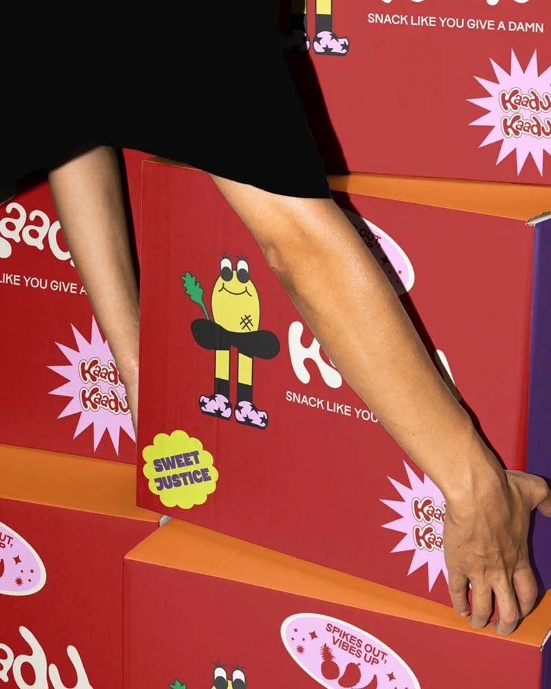
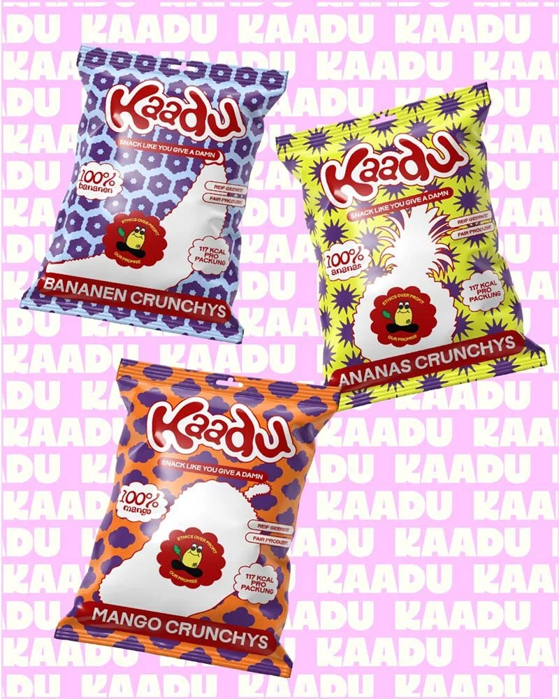
A visual system with bright, saturated colours, bold typography, and flavour differentiation for quick shelf scanning.
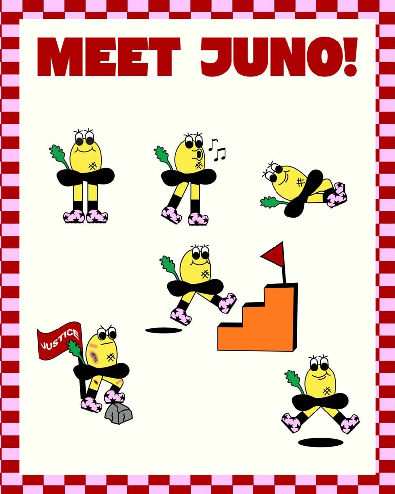
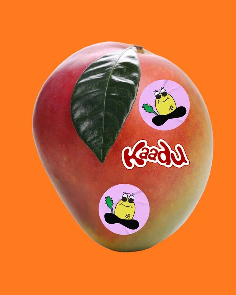
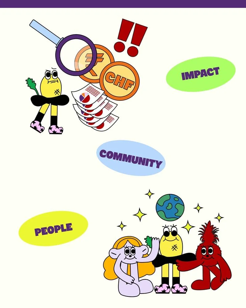
A farmer mascot, Juno, to humanise origin stories and explain complex trade principles in an approachable, relatable way. Juno acts as a friendly guide across packaging, social content, and the website.
Micro-interactions and CTAs that invite customers to learn, share feedback, and see exactly how their purchase impacts communities.
Challenges & Solution
Challenge - Communicating a complex supply chain and redistributive economics simply and memorably.
Solution - Use of Juno to translate technical concepts into bite-sized, human explanations.
—
Challenge - Making activism feel approachable rather than corporate or moralising.
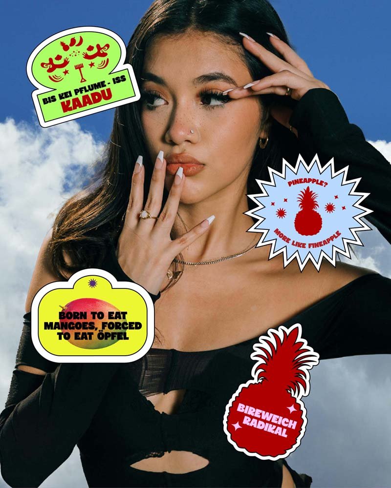
Solution - Tone and art direction that are daring but warm; playful microcopy and social-first content that educates through stories and characters.
—
Challenge - Creating a compelling tagline that captures both values and delight.
Solution - Tested working taglines that read like product-first promises and political statements at once:
“Snack like you give a damn”
“Justice never tasted so sweet”
Here’s how it turned out
Take a look at the final brand design
go from idea soup to “holy sh*t, that’s my brand”
If this project made you feel something… that’s the power of brand design.
Now imagine what that power could do for your brand. Whether you’ve got a fully-formed brief or just chaos in a Google Doc, I’m here to help you shape it into something scroll-stopping.

