Plately - Brand Strategy & Design
Reimagining the meal-kit as a behaviour-first system: less about ingredients, more about easing the mental load of dinner.
Featured by: ODA Awards

Inspired by the State Library Victoria, the identity uses structured visual language to move people from overwhelm to calm. The result is a clear, practical brand that helps users feel organised, rested and in control.
Identifying the problem
For many people, the question “what’s for dinner?” is less about cooking skill and more about cumulative mental load: the small choices and planning that pile up after a long day. Existing meal-kit options often feel prescriptive, visually soulless, or cognitively demanding. Plately needed to present a simple, repeatable rhythm that reduces decision points while preserving agency and dignity.
Target audience
Urban, time-poor households and young professionals who care about eating well but hate decision-making.
They want convenience, clarity, and design that treats dinner as a meaningful ritual rather than another checkbox.
Qualitative Research
What we learned
Dinnertime stress stems from accumulated micro-decisions rather than a lack of cooking ability.
Users adopt systems that reduce cognitive friction and feel reliably repeatable.
Visual cues that communicate order and predictability lower perceived effort and increase adoption.
Key insight: People don’t just want to save time. They want to save mental energy, and they respond strongly to design that makes that saving obvious and pleasurable.
Strategy Development
Position Plately as a cognitive relief system: structure that feels generous, not restrictive.
Strategic pillars:
Structure with flexibility - create repeatable patterns that users can internalise and personalise.
Evidence-informed design - every identity choice maps to a behavioural insight about habit formation and decision-making.
Design moves:
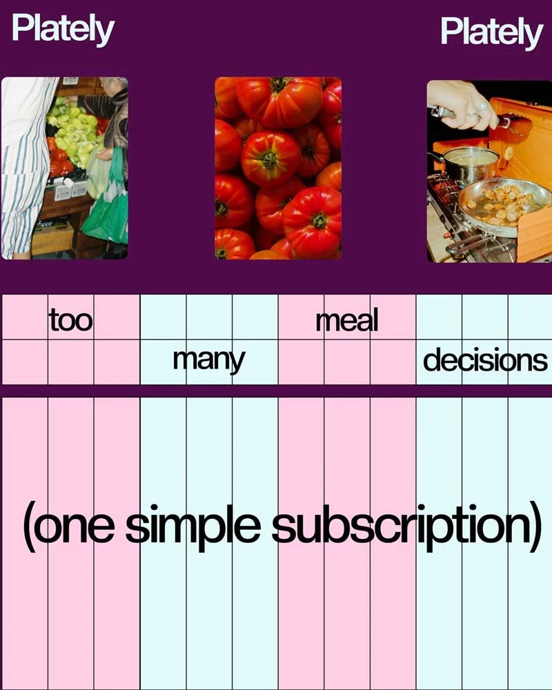
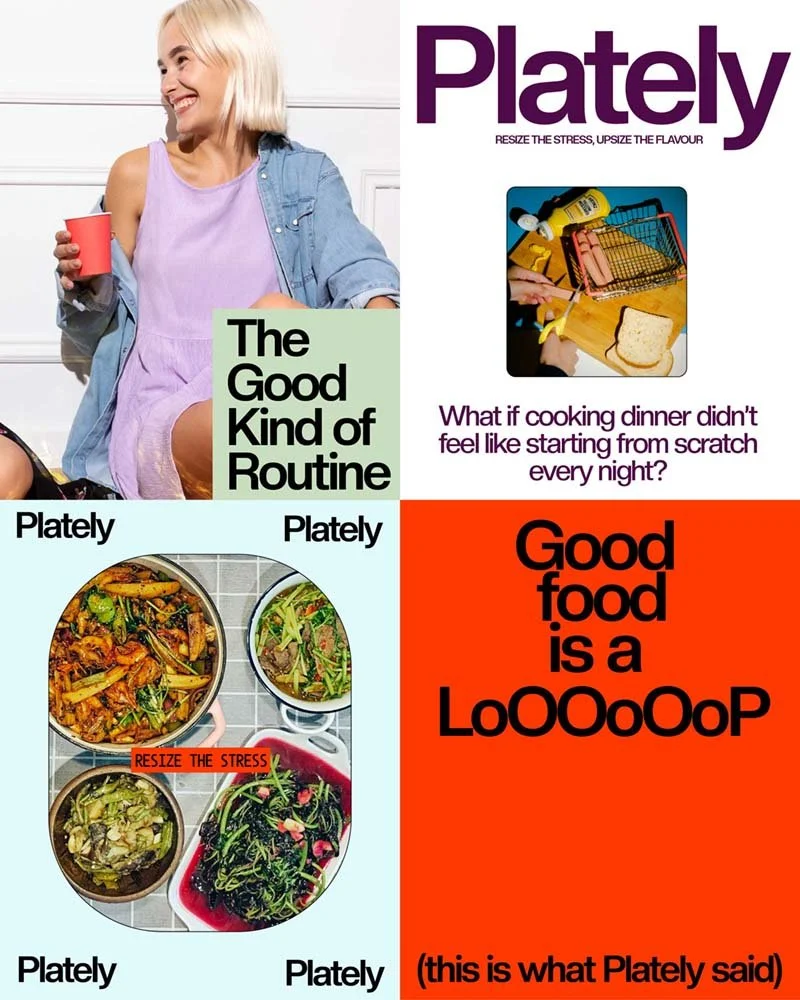
Visual metaphor: library architecture informs the system. Grid-like forms reference the pre-Plately chaos; smooth elongated rectangles embody the calm after. This tension drives the identity.
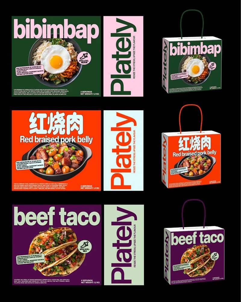
Ritualised product architecture: modular meal components and simple interactions that make assembly intuitive and fast.
Language and tone: calm, human and practical.
Challenges & Solutions
Challenge - Translating a high-level library metaphor into usable, everyday assets.
Solution - Inspired by the State Library of Victoria, we treat the library not as decoration but as a model for mental states. The dense, grid-like language evokes the pre-Plately moment of rigid, fragmented choice; the long, elongated rectangular forms represent the after-state: continuous, directional flow. By favouring long, uninterrupted forms over tight grids, the design reduces visual breaks and guides attention sequentially.
—
Challenge - Avoiding prescriptive or elitist language while still guiding behaviour.
Solution - Microcopy that “resizes the stress”: quick directives, gentle suggestions, and optional swaps. Tone is inviting and practical, never moralising.
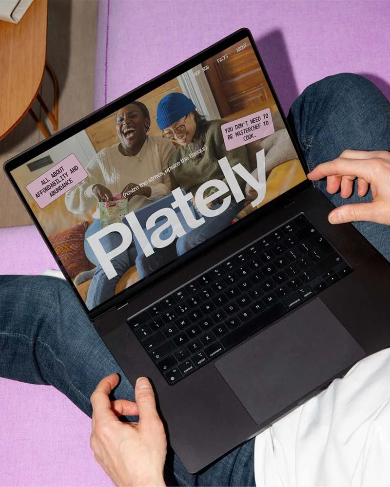
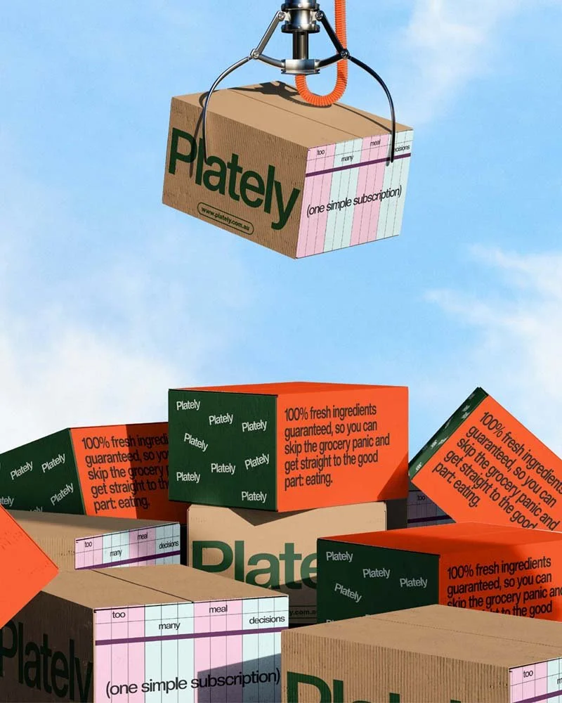
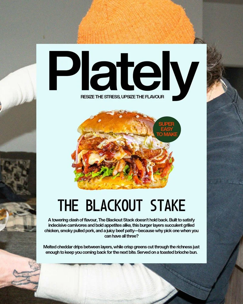
Here’s how it turned out
Take a look at the final brand design
go from idea soup to “holy sh*t, that’s my brand”
If this project made you feel something… that’s the power of brand design.
Now imagine what that power could do for your brand. Whether you’ve got a fully-formed brief or just chaos in a Google Doc, I’m here to help you shape it into something scroll-stopping.